SUMMARY
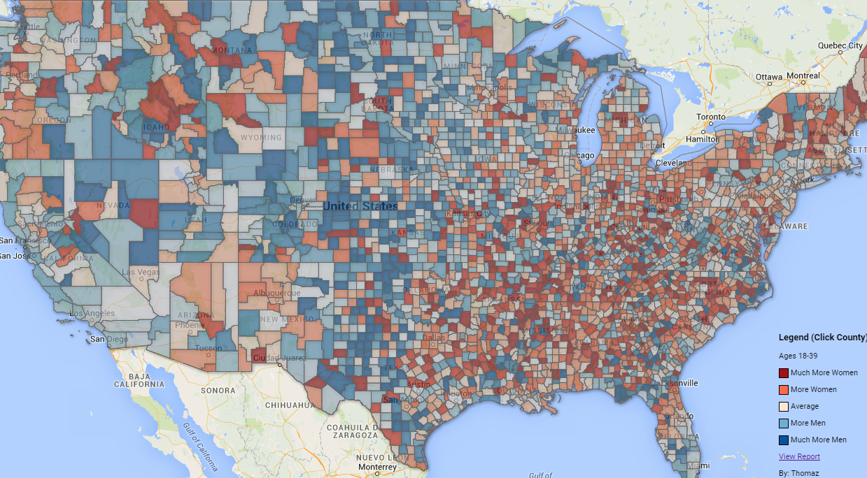
What are the easiest and hardest places to find a date? This map uses the gender ratio of single people (not married) from the 2013 census and the gender ratio from online dating profiles. The census data is a good measure of how many single people live in a county; however, it can’t measure how many people are in relationships without being married nor if a person is interested in finding a date nor if a person is heterosexual. The data from online dating profiles fills these gaps. The results reveal the US dating scene is far from homogeneous. The easiest place for a straight woman to find a date (hardest for a man) is San Jose-Sunnyvale-Santa Clara, CA and the easiest place for a straight man to find a date (hardest for a woman) is Charlotte-Concord-Gastonia, NC-SC.
VIEW FULL SCREEN (click a county for more info)
- Much Easier For A Man To Find A Date
- Easier For A Man To Find A Date
- Average
- Easier For A Woman To Find A Date
- Much Easier For A Woman To Find A Date
- Colors are relative to other counties
INTRODUCTION
The aim of this report is to find the easiest and hardest places to find a date. The report will use “singles” data from the 2013 US census (acs5 dataset) and data from online dating profiles. Singles data means people who were never married, divorced, or widowed. The easiest and hardest places will be judged by the gender ratios from both data sources for all races in the 18-39 age range. Data from the census is relatively easy to get and interpret. Data from online dating profiles is complicated to get, extremely difficult to tidy-up, and require many assumptions.
[table id=5 /]
INTERPRETING THE RESULTS
Why are the singles ratios so high? The most poignant reason is that men, generally, are in relationships with younger women. (Wiki article) There is an awkward situation going on in the 18-39 age range. It’s impossible to see an 18 year old man dating an 8 year old woman (girl) however, it’s completely normal and common to see a 49 year old man dating a 39 year old woman or a 40 year old man dating a 30 or 35 year old woman. The point is that in this young age range we have young men and older men (not in the analysis) competing for the same pool of women. Ultimately this means that there is allot of competition for younger women. The “Singles Ratio” is from the census and can be interpreted literally e.g. a ratio of 1.29 means for every 100 physically countable single women there are 129 physically countable single men. The “Dating Ratio” is complicated. It’s a ratio of male/female profiles; however, there are many assumptions needed to interpret it literally as males per female (see assumptions.) Its absolute value may be frivolous but its value relative to other counties is meaningful. Why are the dating ratios so high? Because women are very likely to receive uncomfortable messages (link) and hesitant to create a profile or delete their profile shortly after (which wouldn’t get counted in the data.) The results seem to paint a grim picture for single men; however, there is good news for single employed men. Employed single men have a favorable ratio in just about every metro area. (link)
DISCUSSION
A tale of opposites – Manhattan, NY where the streets are paved with young single women and SF Bay Area, CA where the streets are paved with young single men. The Bay Area scored as the hardest place for a man to find a date (best place for a woman to find a date.) The New York Metro Area didn’t rank as the worst place for a woman to find a date; however, if we zoom in from metro areas to the county level, Manhattan is an anomaly. Here is a very granular map of singles in NY (link) and here is a very granular map of singles in the Bay Area (link.)
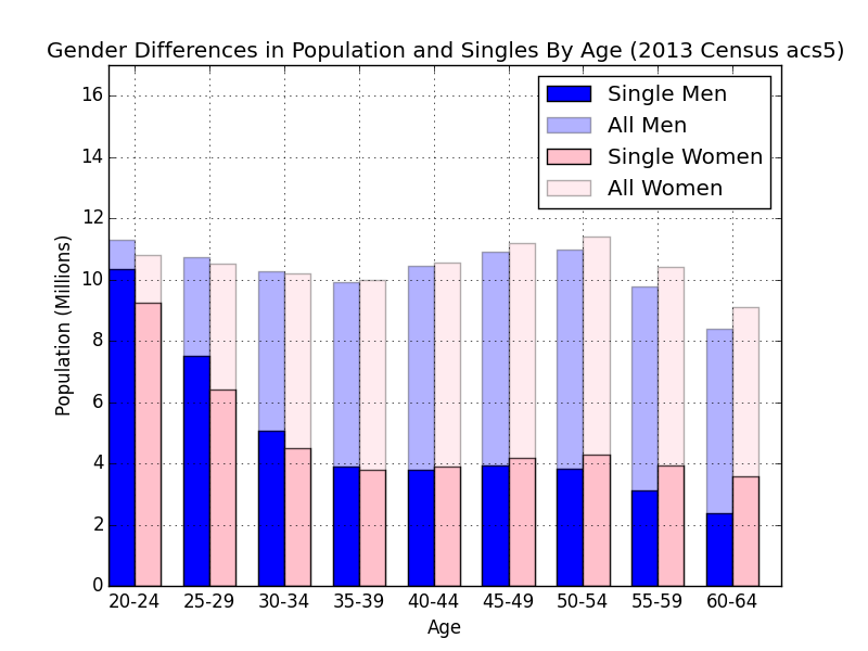
This chart is packed with information. The absolute gender ratio by age, the gender ratio of single people by age, and the ratio of married people by age. The ratio for singles in the 20-24 age range is 1.12 (male/female) and in the 60-64 age range it’s 0.67. If you would like to reproduce this chart, here is a link to the text of the Python script I wrote to create it.
The dating ratio is a ratio of male / female profiles and the singles ratio is a ratio of single men / single women. Is there a relationship between these ratios? One would expect a county with more single men to also have a higher dating ratio.
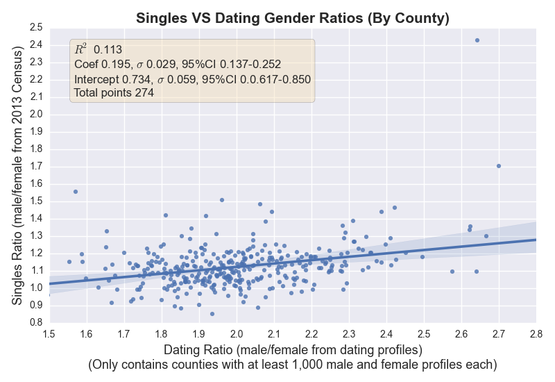
The relationship is very weak but undeniably there with a 95% confidence interval. The assumption is that the rest of the variability is explained by the fact that many singles are in relationships without being married or not interested in having a relationship. Thus, data from dating profiles adds a powerful layer of information regarding the dating scene in each county.
METHODOLOGY AND ASSUMPTIONS
Data from PoF dating profiles were obtained by a bot which scraped a profile every few seconds during a two year period. There are many assumptions required to tidy-up these data. On PoF, each profile has a unique ID that was generated when the profile was created. The ID increments by one after a new profile is created. We can reasonably assume that the profiles from a random sample of these ID’s will reflect the actual gender ratio. Men and women create duplicate profiles and delete their profiles at the same rate. This is a “heavy” assumption because if either women or men create duplicate profiles for a fresh start or delete their profiles at a different rate it will distort the ratio (a confounding variable). However, even if this is the case, we can further assume that these distortions occur with equal probability in every county. This means that in the case of distortions the absolute ratio will be frivolous but the difference in ratios between counties is useful. Also, since a user can edit the “location” text in their profile, identifying their location is extremely difficult. Also, PoF is rather global and there are many profiles outside the US. A database with every city in every county and every county in every state was created along with each unique Federal Information Processing Standard code (FIPS) number e.g. 12086 – 12 is Florida and 086 is Miami-Dade County. However, identifying the county of a user is not straight forward. The “location” text contains the city and state of a user but some states have multiple cities with the same name. For these cases the user was binned in a random city using the population of the cities as weights for the random assignment. Furthermore, “location” text may be misspelled or incomplete thus a fuzzy text matching algorithm must be used – Levenshtein distance. There are millions of profiles and tens of thousands of cities which makes raw matching a bit impractical. The first step is to just match the state which eliminates many thousands of possible city matches. Next, try to match the user’s city to incorporated cities (since about eighty percent of people live in incorporated cities) which further eliminates hundreds of other possible matches. Next, if no city match is found for a user, try large unincorporated areas. If no match is yet found, try niche places. The Levenshtein distance ratio threshold is 0.85 for states and 0.68 for cities. Since these computations are time-expensive (finding a user’s best match city with thousands of possibilities) their results were cached in a hash table so that other users with the same location text could retrieve the same cached result object (overall about eighty five percent of profiles retrieved their result from cache which reduced computation time dramatically.) Only heterosexual people of ages 18-39 of all races were included (no offence to gay people, it’s just data.) Heterosexual people were identified by the “gender” and “seeking” text field. If the gender field was the same as the seeking field the profile was excluded i.e. female seeking female and male seeking male were excluded. There are twelve colors on the map. They range from dark red to whitish to blue. The darker the red the more women are seeking partners (easier for men,) the darker the blue the more men are seeking partners (easier for women.) The colors are based on the square root of the gender ratio of singles times the gender ratio of dating profiles. The situation gets complicated if there were fewer than one hundred males and females each. In this case the ratio was estimated just for the sake of having a complete map for visualization.
Feature Image
Feature Image – The Easiest And Hardest Places To Find A Date
If you would like to leave a comment or contact me please do it on reddit
LINK TO REDDIT POST
UserName: Wikilicious
If you would like to contact me directly my email is: vjqocbytz@gmail.com (everything before @ is encrypted with a simple Caesar cipher of 2 i.e. v=t, j=h, q=o, the email should resemble my name and a car from Subaru)